
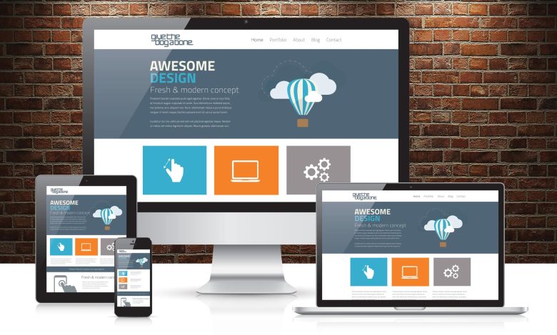
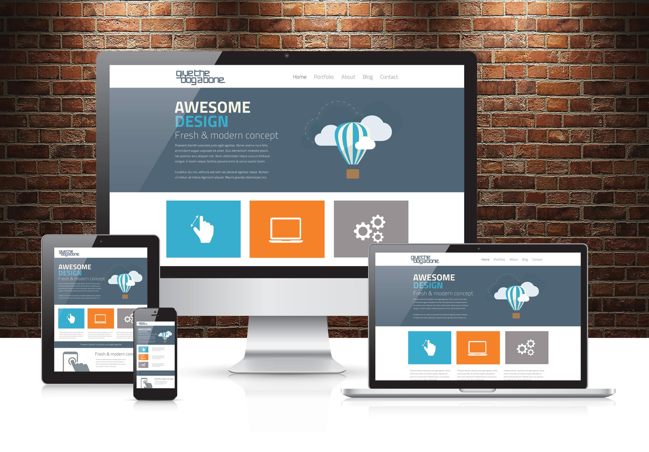
The rise of mobile devices has transformed how people access the web. A website that looks great on a desktop but fails on a smartphone can lose users and revenue. This led to the emergence of Responsive Web Design (RWD)—a design approach that ensures websites work seamlessly across all devices.
In this article, we’ll explore the evolution of responsive design, its principles, best practices, and why it remains essential in modern web development.
1. What Is Responsive Web Design?
Responsive Web Design is an approach where web pages adapt to the size, orientation, and capabilities of the user’s device. Instead of creating multiple websites for different devices, RWD allows a single website to deliver optimal experiences across desktops, tablets, and smartphones.
Key components:
- Flexible layouts
- Fluid grids
- Media queries
- Responsive images and typography
2. Early Days: Fixed Layouts
Before RWD, websites often used fixed-width layouts (e.g., 960px) designed for desktop screens.
- Pros: Simple to implement
- Cons: Mobile users had to zoom and scroll horizontally
3. The Shift to Fluid Layouts
To accommodate different screen sizes, designers began using fluid layouts:
- Use relative units (%, em) instead of pixels
- Content adjusts proportionally to the viewport
- Improved accessibility on various devices
4. Media Queries and Breakpoints
The real breakthrough came with CSS3 media queries:
- Media queries allow specific styles for different screen sizes
- Breakpoints define points where the layout changes (mobile, tablet, desktop)
5. Flexible Images and Typography
- Images: Use
max-width: 100%to prevent overflow - Responsive images:
srcsetallows different images for different resolutions - Typography: Use relative units (
em,rem,vw) to scale fonts dynamically
6. Mobile-First Design
Modern RWD follows the mobile-first approach:
- Start by designing for the smallest screen
- Gradually enhance the design for larger screens
- Ensures essential content is prioritized for mobile users
7. Frameworks Supporting RWD
Frameworks like Bootstrap, Foundation, Tailwind CSS made RWD easier:
- Pre-built responsive grids
- Mobile-first utilities
- Consistent spacing, typography, and components
8. Challenges in Responsive Design
- Complex layouts may require multiple breakpoints
- Testing across numerous devices can be time-consuming
- Performance issues if too many images or media are loaded
9. Beyond Screens: Future of RWD
RWD is evolving to support new devices and contexts:
- Smart TVs, wearables, AR/VR interfaces
- Voice interfaces and IoT devices
- Adaptive and context-aware designs based on device capabilities
10. Conclusion
Responsive Web Design has come a long way from fixed-width layouts to flexible, mobile-first designs. In today’s world, where users access content from a variety of devices, RWD is not optional—it’s essential.
By following responsive principles, designers and developers can create web experiences that are accessible, usable, and enjoyable on any device, ensuring long-term user engagement and satisfaction.