
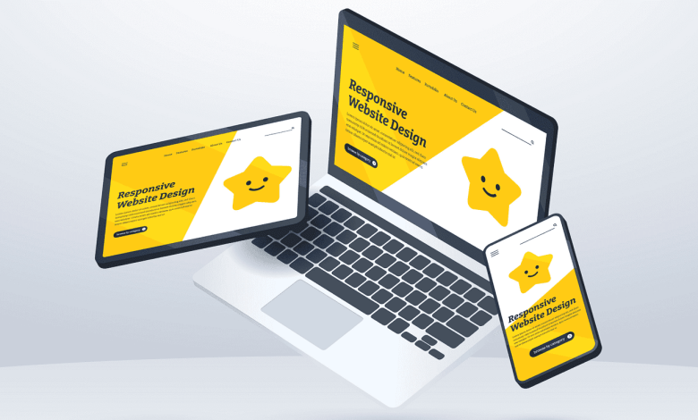
In today’s digital world, users access websites from a wide variety of devices—smartphones, tablets, laptops, desktops, and even TVs. A website that looks great on a desktop but breaks on mobile is no longer acceptable. That’s why responsive design is a critical skill for every web developer.
This article will guide you through the principles, techniques, and tools for making a website fully responsive, ensuring it works seamlessly across all screen sizes.
1. What Is Responsive Web Design?
Responsive design is an approach that makes web pages adapt to different screen sizes and devices. Instead of creating separate sites for desktop and mobile, developers build one website that automatically adjusts its layout.
Key benefits:
- Better user experience
- SEO ranking boost (Google prioritizes mobile-friendly sites)
- Cost efficiency (one codebase for all devices)
2. The Core Principles of Responsive Design
To create responsive websites, keep these principles in mind:
- Fluid layouts: Use relative units like
%orreminstead of fixed pixels. - Flexible images: Images should scale with the layout.
- Media queries: CSS rules that apply at certain breakpoints.
- Mobile-first approach: Design for small screens first, then scale up.
3. Using Viewport Meta Tag
Always start with this tag in your <head>:
This ensures your site scales correctly on mobile devices.
4. Media Queries
Media queries let you apply different styles depending on screen size.
✅ Example:
5. Responsive Layout Techniques
- Flexbox: Great for one-dimensional layouts (rows/columns).
- CSS Grid: Ideal for complex two-dimensional layouts.
- Fluid grids: Replace fixed widths with percentages.
✅ Example with Flexbox:
6. Responsive Typography
Instead of fixed font sizes, use scalable units:
emorremfor relative sizing.clamp()for fluid text.
✅ Example:
This scales between 1.5rem and 3rem depending on viewport width.
7. Responsive Images
Images must adapt to screen size without breaking layout.
✅ Example with HTML:
Or using srcset:
8. Mobile-First vs Desktop-First
- Mobile-first: Start designing for small screens, then scale up with
min-widthqueries. - Desktop-first: Start with large screens, then scale down with
max-widthqueries.
Modern best practice: mobile-first for better performance and SEO.
9. Testing Responsiveness
Tools to check responsiveness:
- Browser DevTools (responsive mode).
- Online testing tools like Responsinator.
- Real devices (nothing beats actual testing on phones and tablets).
10. Frameworks and Tools
Instead of coding everything from scratch, you can use frameworks:
- Bootstrap: Prebuilt responsive grid system.
- Tailwind CSS: Utility classes for responsive breakpoints.
- Foundation: Another responsive CSS framework.
Conclusion
Making a website fully responsive is no longer optional—it’s a necessity. By mastering fluid layouts, media queries, responsive images, and scalable typography, you’ll ensure your websites look professional on all devices.
Whether you choose to build responsiveness from scratch or leverage frameworks like Tailwind or Bootstrap, the key is to test thoroughly and prioritize user experience.
Responsive design = happy users + better SEO + future-proof websites.